|
NATIONAL PARK SERVICE
Park and Recreation Structures |

|
SIGNS
AS DEVELOPMENT of any preserve for recreational use proceeds there is bound to be coincident multiplication in the number and kinds of required signs and related objects. If their purpose is directional, designative, regulatory, or cautionary, they are classified as "Signs" in this compilation. If their intent is to be informative of matters of historical or natural interest pertinent to the park area, they are herein termed "Markers" and, being thus incident to cultural recreation, they are discussed along with structures which facilitate that phase of recreational pursuit.
Nothing in parks, unless it be the entranceway, offers wider legitimate scope for individuality in conveying the characteristics or background of the particular area than the signs and markers. These can be the embodiment of those rare and distinguishing features that have dictated the establishment of the park—park-motifs-in-miniature.
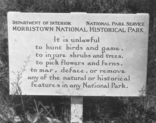
Well-keyed to an historical period are the signs at Morristown National Historical Park. Here of course the theme is the Revolutionary era.
A visitor on pilgrimage to the reconstructed village of Lincoln's young manhood in New Salem State Park, Illinois, is subtly put in receptive and reverent mood for the illusion of a midwestern backwoods village of the 1830's by the very character of the stylized signs and markers. The black, uncertain lettering on white background, in its hand-made irregularity and wavering course lines, recalls the crude typography of the newspapers and handbills of the period and place. Instantly imagination is in pitch, and understanding in tune, with the melody about to be resung for us.
The number of signs actually purposeful in any area and the strategic placing of them should be thoughtfully determined. Signs too generously provided quickly bring protests from those who crave their Nature uncluttered. A shortage of directional information will annoy those who have neither time nor liking for groping their way along roads and trails without benefit of adequate sign service.
A proper scale in the structural members of a sign is especially to be desired. In such a minor item as a sign it is obligatory wherever possible to evidence the employment of native materials. When the trees on an area are stunted or a second growth, it is unfitting to import massive materials for signs that will sharply accent the deficiency of the natural surroundings. It is equally inappropriate to underscale the structural members of a sign placed in an area of large trees.
The scale and legibility of the lettering employed on signs also merit careful consideration. The legends of cautionary and directional signs, more than those of other purpose, call for terseness and instant legibility at a proper distance. Hence the scale of letters reading "Sharp Curve", "Stop", "Low Water Crossing", and the like is subject to standards entirely different from a lengthy recital of rules for campers or picnickers. However appealing and appropriate in respect to an area may be the qualities of quaintness and individuality in stylized lettering, legibility has the call over other considerations for all signs of cautionary intent.
Where there is need for signs in great numbers as in parks and park systems of vast extent, cost and durability are matters of budgetary importance. The well-considered sign will be sturdy. It will "read" well and continue to do so with the least maintenance expense. The metal sign with baked-on enamel lettering may win the pennant in the Minimum Maintenance League, but in the Park Character League it surely rates what the sports scribes refer to as the "cellar position." Lettering painted on wood must be frequently renewed. This adds to maintenance charges. The renewal of lettering painted on a flat surface is painstaking work. If the lettering be initially incised, or embossed by the blow torch and template technique of burning away the background, the renewal of the paint on the letters is more quickly done because there is a definite guide for the painter's brush.
Lettering by burning, avoiding all use of paint, has been done in many parks, but probably nowhere on the scale or with more successful results than in the metropolitan mountain parks of Colorado. So many signs were required in those areas that it was found practical to make heavy sheet iron stencils of a selected alphabet in several sizes and burning irons fashioned to fit them. The desired lettering is marked out on the wood panel only to insure proper spacing. From this point the making of the sign is a mechanical operation. The stencils are placed in their proper position and the letters burned into the wood with the hot irons to a depth of about three-quarters of an inch. This produces signs legible and durable. Barring an act of God, like a cyclone, or assault by that instrument of Satan, the initial carver, signs like these promise long life.
The jackknife vandalism to which all park construction is subject can be somewhat checked in the case of signs by the practice of placing them either well below or well above the convenient working range of the jackknifer. This most vulnerable stratum is between three and six feet off the ground. In spite of all the evidence in our parks to the contrary, this type of predator is a physical, as well as mental, sluggard and is likely to think twice (we flatter him) before he will stand on his head or shinny up a post to accomplish his scandalous, vandalous ends.
Twin to the jackknife pest is the souvenir hunter. Signs too appealingly picturesque and easy to get at and carry away fall prey to his pack rat instincts. His depredations put very definite limits on what it is within reason to attempt in the way of signs.
The day when the quintessence of naturalism for park signs was to paint them on boulders and cliffs is within the memory of many of us. Happily our developing sense of fitness has had a swing away from this sort of thing. The utter inappropriateness of nailing signs to trees is also better understood in the light of today's park-mindedness. Perhaps a warning should be sounded against a noted recent tendency to bring to the park sign something of modern, commercial, eye-arresting technique. By no means need the park entrance sign seek to compete with the 24-sheet cigarette poster farther down the road nor is there merit in three or four messages conveyed by as many different signs wherever all might logically be accumulated to one sign. Several sign groupings that successfully exemplify this point are included among the illustrations on the following pages.

Morristown National Historical Park

New Salem State Park, Illinois
| <<< Previous | <<< Contents>>> | Next >>> |
park_recreation_structures/part1c.htm
Last Updated: 04-May-2012