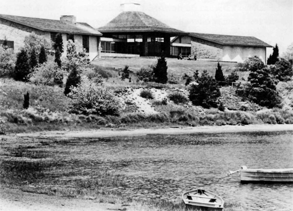
CELEBRATING THE NATIONAL PARK SERVICE CENTENNIAL • 1916-2016
Chickamauga & Chattanooga National Military Park
|
First appearing in a 1999 issue of CRM Bulletin (Vol. 22, No. 9), the following two articles summarize research by the NPS Park Historic Structures and Cultural Landscapes Program and their assessment of the legacy of Mission 66 in the National Park System. The Legacy of Mission 66Mission 66 and "Rustication" 
The goals of national park planning and design have remained remarkably constant since the earliest days of the National Park Service: park buildings and other structures should be kept to a minimum and be designed so that they "harmonize" with their landscape settings and reduce impacts on natural systems. What has changed, over time, is what we mean by "harmonize," and how we perceive and understand natural systems and the extent of impacts to those systems. If preserving nature has remained a constant goal for park planning, nature itself has been a shifting concept. A first generation of Park Service designers provided a powerful response to this challenge in the form of Park Service "rustic" construction. Park Service rustic was essentially picturesque architecture that allowed buildings and other structures to be perceived as aesthetically harmonious elements of larger landscape compositions. The pseudo-vernacular imagery and rough-hewn materials of this style conformed with the artistic conventions of landscape genres, and therefore constituted "appropriate" architectural elements in the perceived scene. The logs and boulders of rustic facades added to the illusion of vernacular craft, and reduced visual contrasts between building and site. But Park Service rustic design did not harmonize simply because building materials suggested the textures and colors of nearby trees and rock formations. Elaborately ornamental facades, for example, often called attention to themselves, and buildings were conspicuously sited as scenic focal points. Rustic buildings harmonized with the site not just by being unobtrusive, but also by being consistent with an aesthetic appreciation of the place. Rustic development helped preserve nature, in this sense, because nature was conceived largely as scenery. But by the 1930s different ideas about both nature and architecture began to be felt at the Park Service. Advances in wildlife biology and other natural sciences began to yield a more complex, scientific idea of nature. As recently described by Richard West Sellars, Park Service biologist George M. Wright, in particular, forced at least some park managers to face the fact that the biological degradation of parks could be invisible, in the sense that it had no effect (or even, according to some, a positive effect) on park scenery. This more scientific approach began to define nature in the parks more as biology than as scenery. American architecture also began to change fundamentally in the 1930s, as architects began to consider new approaches to design more or less directly inspired by European Modernism. Changes in building technology following World War II encouraged this trend. Advances in steel framing, reinforced concrete, and prefabricated architectural elements offered profound practical and economic advantages over more craft-oriented construction techniques. By the end of World War II, both nature and architecture were in the process of conceptual transformations in the United States.
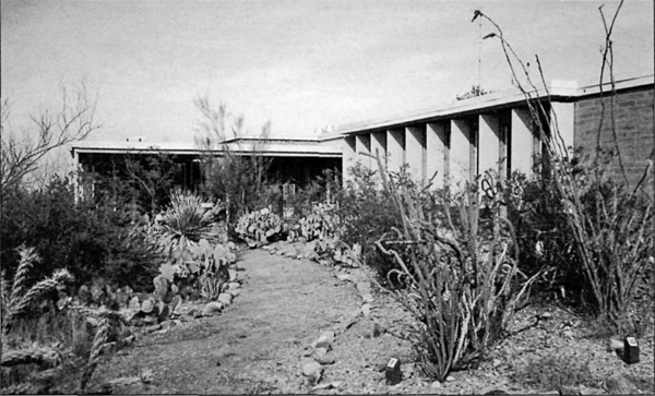
At the same time, the national park system was immersed in one of the largest crises it had ever faced. During the postwar years, more visitors than ever before overwhelmed many of the most popular national parks, and virtually everyone arrived by car. Rustic facilities developed 20 or 30 years earlier were overwhelmed in many parks, where long lines formed outside comfort stations and automobiles spilled onto meadows and roadsides. In 1956, Park Service director Conrad L. Wirth initiated the "Mission 66" construction program, a 10-year campaign of new park development to address what had become deplorable conditions. Wirth was trained as a landscape architect, and in the 1930s he had been responsible for the Park Service's state park development program. His chief of planning and design, Thomas C. Vint, had been chief landscape architect since 1927 and was one of the originators of the Park Service rustic style. Other Park Service designers active in the 1950s, such as architect Cecil Doty, had been principal Park Service designers during the rustic era. But if in many ways this group continued the tradition of park planning that they had created over the previous decades, in other ways, postwar conditions, changing ideas about nature, and new practices in the construction industry necessitated new approaches. Mission 66 designers needed to find new ways for park development to "harmonize" with park settings. As the negative effects of larger numbers of visitors and their vehicles began to be better understood, for example, Mission 66 planners responded by centralizing services and controlling visitor "flow" in what were called "visitor centers." In some cases, planners proposed removing some park facilities and relying on motels and other businesses springing up in gateway communities to serve visitors. Enlarging parking lots and widening roads encouraged this trend, since faster roads made access in and out of parks quicker; but under Mission 66, parking lots, comfort stations, gas stations, and other visitor services were bound to proliferate, in any case. Conrad Wirth remained firmly committed to the idea that the parks were "for the people." Mission 66 planning proceeded under the longstanding assumption at the Park Service that increased numbers of visitors (and their cars) should be accommodated. Modernized and expanded park development, usually restricted to existing road corridors within the parks, was therefore proposed as the essential means of preserving nature to the greatest degree possible, while making sure visitors were not turned away. But if Mission 66 continued traditional assumptions, it also exploited the functional advantages offered by postwar architectural theory and construction techniques. Mission 66 architects (whether in-house or consultants) employed free plans, flat roofs, and other established elements of modern design in order to create spaces in which large numbers of visitors could circulate easily and locate essential services efficiently. The architects also used concrete construction and prefabricated components for buildings, highways, and other structures. Development was often sited according to new criteria, as well. Visitor centers were located according to functional concerns relating to park circulation, and so were not calculated as components of larger landscape compositions. Although Mission 66 park development was no longer truly part of the landscape, in this sense, in many cases this meant that buildings could be sited less obtrusively, near park entrances or along main roads within the park. Stone veneers, earth-toned colors, and low, horizontal massing also helped continue the tradition of reducing visual contrasts between building and site. Mission 66 architecture was not picturesque or rustic, but it did "harmonize" with its setting (at least in more successful examples), although in a new way. Stripped of the ornamentation and associations of rustic design, Mission 66 development could be both more understated and more efficient than rustic buildings.
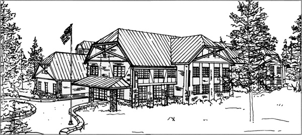
Architectural tastes, however, continue to evolve, as does the idea of nature. The widespread construction of Mission 66 caused a backlash among environmentalists who wanted less development in parks, even if it meant effectively restricting public access. Modern architecture has also been condemned as insensitive, and "neorustic" has been espoused as a contemporary style more appropriate for park settings. But it is difficult for neo-rustic architecture to do more than recall the meaning and authority of the original. Facades may once again be covered with stone and logs, but this stylistic revival has not included a return to the planning and design theory of the rustic era, which sited development in or near scenic areas in order to create total landscape compositions of structures and site. Park development today is often sited where it will have the least "environmental impact," even if the chosen areas lack scenic qualities. The preservation of nature, as it is understood today, demands a planning process that to some degree prevents picturesque architecture from "harmonizing" as it did in the past. The taste for neo-rustic design has also resulted in numerous proposals to "rusticate" Mission 66-era architecture by adding new facades of log, stone, or simulated adobe. Original rustic facades, in fact, typically covered standard balloon-frames and concrete foundations, so why not add neo-rustic facades to Park Service modern buildings? At times, this approach may be very successful. New facades, however, will not change the basic planning assumptions under which the buildings were sited. Neither will they alter structural systems and materials that allowed the use of free floor plans and unorthodox fenestration. Original Mission 66 designs were often successful, in their own way. But by rusticating exteriors, we may lose the chance to restore the original aesthetic and functional integrity of these buildings (many of which have suffered ad hoc alterations over the years), and in the worst cases we may end up with second-rate, modern-neo-rustic hybrids, with neither aesthetic nor functional coherence. The original rustic era was a period of great accomplishment at the Park Service. There is less sympathy, today, for the Mission 66 planning techniques and design styles devised by many of the same Park Service professionals in the 1950s. But Mission 66 produced many fine examples of public architecture imbued with a progressive sense of government's role in the management of national parks and historic sites. In terms of both historic preservation and simple practicality, it makes sense to learn more about Mission 66. Ethan Carr is a historical landscape architect and at the time of this publication he was with the Park Historic Structures and Cultural Landscapes Program, Washington, DC.

When Cecil Doty began his career with the Park Service in the early 1930s, adobe, boulders, and hand-hewn timber were the basic materials for park buildings. The rustic style not only reflected the current philosophy toward park stewardship, but also the contemporary economic situation and nationally popular architectural trends, such as Craftsman bungalows. With an excess of manpower and raw materials, the Park Service could afford extraordinarily well-crafted facilities. After World War II, everything changed. The Park Service experienced an explosion of visitors: an increase from 3,500,000 per year in 1931 to almost 30,000,000 by 1948. As an architect for the Western Office of Design and Construction (WODC) in 1954, Doty would find himself accommodating Park Service needs with modern buildings of steel, glass and concrete block. Doty felt that Mission 66 planners had little choice but the modern style in which to clothe their innovative plans for the nation's parks. The need to supervise and educate increasing numbers of visitors created an urgent call for scores of "visitor centers," which would centralize activities and services and prevent the public from venturing thoughtlessly into fragile natural areas. In the postwar era, modern architecture not only represented progress, efficiency, and a scientific approach, but it also came "readymade" in mass-produced parts that could be constructed on site cheaply and efficiently, which was important considering the urgency of the situation. Like the other park architects confronting the postwar crisis, Doty designed centralized visitor facilities that provided access to diverse basic services and introduced visitors to the park environment. When possible, the new facilities featured important views, which could be exploited with the large windows typical of the period architecture. If rustic buildings were designed to be seen, Mission 66 visitor centers were often designed to see from, whether through a window wall or from an integral outdoor terrace. The four Mission 66 visitor centers that have been determined to meet National Register criteria (the Quarry Visitor Center at Dinosaur National Monument, the Wright Brothers National Memorial Visitor Center, the Visitor Center and Cyclorama Building at Gettysburg National Battlefield, and the Administration Building at Rocky Mountain National Park) illustrate the importance of siting and circulation to this new building type. The "change in philosophy" so obvious to Doty involved more than substituting concrete block for adobe.
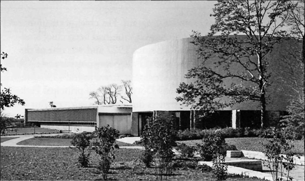
When Conrad Wirth approved the design of Quarry Visitor Center in 1957, curators in the Museum Department knew that traditional Park Service interpretation was changing. The museum staff had asked for a windowless building with artificial lighting, conducive to the display of interpretive materials and objects. But architects in the WODC favored a radically different approach. The San Francisco architectural firm of Anshen and Allen, as consultants to the Park Service, designed a visitor center with extensive glazing that they felt would emphasize the site's location on a natural stone ridge. Visitors were offered a very different experience than that of the traditional park museum. After walking up a curving concrete ramp to the second floor terrace, they could view the fossilized dinosaur bones themselves, in situ. A stairway at the far end of the terrace led to the lower level and museum exhibits, including a window into the paleontologists' working laboratory. Circulation through Quarry Visitor Center gave visitors a unique sense of the continuous fossil deposit encased in the rock, as well as an idea of the paleontologists' daily activities. The use of modern materials and building techniques allowed Anshen and Allen to create this relationship with the site, and the flexible building program resulted in a dynamic experience. Siting and spatial planning were an equally significant part of the visitor center Ehrman Mitchell and Romaldo Giurgola designed for Wright Brothers National Memorial in 1958. As they entered the lobby, visitors could see through large glass panels to the "first flight" area beyond. After proceeding through a dimly lit exhibit room, they entered a double-height assembly space with a dome roof and floor-to-ceiling windows. Interpretive rangers gave talks here, where they could point out the reconstructed hanger and bunker outside, as well as the markers indicating the distances of four early flights. The memorial erected to honor the Wrights in 1903 was clearly visible to the south, high atop Kill Devil Hill. By the time they left the building, visitors were familiar with most of the significant themes and features of the site. Again, modern design and construction was used effectively to create strong connections between the interpretive spaces inside, and the features preserved in the park itself. As at the Wright Brothers site, circulation was also used to create a strong sense of commemoration in the design of the visitor center for Gettysburg National Military Park. The primary programmatic requirement at Gettysburg was to provide a massive cylindrical space to house the historic cyclorama painting. But architects Richard J. Neutra and Robert E. Alexander used the building program to create a memorable procession through the building. As visitors followed the path from the parking lot, they were introduced to the enormous drum housing the cyclorama. A mysterious source of water above the office wing fed a ground level reflecting pool. The sense of mystery increased once they entered the building and followed a corridor to the cyclorama entrance. A spiraling ramp took them through the semi-darkness and into the center of the cylindrical painting. After viewing the painting, visitors then exited onto the second floor and emerged on the other side of the building, where a ramped walkway led up to a rooftop viewing terrace. From here, the panoramic view of the battlefield was almost identical to that of the painted depiction. The trip from the parking lot, through the building, and out to the battlefield was carefully choreographed to orient visitors, to interpret the historical significance of the site, and to provide a dynamic relationship between interpretation and the subsequent experience of the park itself.
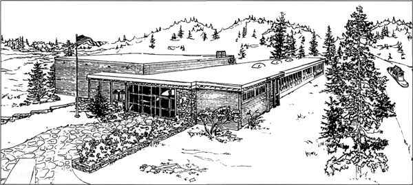
Even the Administration Building at Rocky Mountain National Park, a facility actually sited outside the park, incorporated scenic views of park features into its circulation plan. The visitor center designed by Taliesin Associated Architects in 1964-65 faced the main road into the park; but circulation inside was oriented toward views of the Front Range on the opposite side of the building. An exterior balcony around the auditorium end of the building framed the highest mountain in the park—Long's Peak—in a bay of the balcony. Visitors entered the balcony from one end of the main lobby and, after walking around three sides of the exterior, re-entered the mezzanine of the auditorium. From here, they could either walk downstairs to the main auditorium or return to the lobby. Circulation through the building depended on this route from the lobby, "to the park," and then back inside. Although these buildings have the integrity to qualify for the National Register, today none retain the original circulation patterns described here. Quarry Visitor Center is often entered via its original exit. The windows that used to reveal the "first flight" area at Wright Brothers are now obscured by a bookshop. The Cyclorama Building lacks its water features, and visitors are no longer directed up to the exterior terrace; and here, as well, the lobby has been cluttered with retail sales items, a common problem with visitor centers of this period. At Rocky Mountain, the Administration Building's balcony still exists, but was rendered useless by a projection booth that sealed the auditorium entrance. These alterations significantly affect our experience of each building. In fact, many of the qualities Mission 66 architecture is sometimes assumed to lack—relationship to the park landscape, sensitivity toward the visitor's experience, and concern for the natural environment—were often carefully considered aspects of the original designs, subsequently impaired by alterations. As we begin to assess the National Register eligibility of the remaining original Mission 66 visitor centers, it is important to remember that decades of change have already influenced the appearance and use of buildings we now call Mission 66. The philosophy behind the Mission 66 program was not merely a matter of employing modern architecture, but a strategy to preserve resources, educate the public, and provide standard services in parks throughout the country. Whenever possible, Mission 66 visitor centers should be evaluated according to their successful fulfillment of such valuable historical functions. Sarah Allaback, Ph.D., is an architectural historian and author of Mission 66 Visitor Centers: The History of a Building Type Washington, DC: Park Historic Structures and Cultural Landscapes Program, 1999. | |||||
